
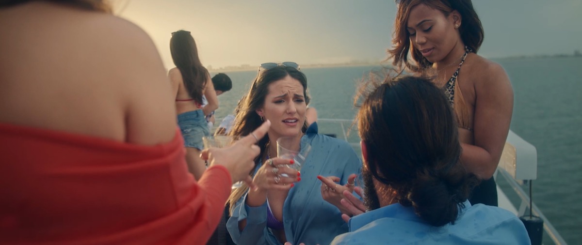
Skin has to hold.
Faces cannot feel muddy, plastic, or accidental. Clean skin makes the room feel controlled before a word is spoken.
Color grading services in Tampa for brand films, commercials, interviews, music videos, documentaries, and social campaigns. Built for clean skin, protected product color, matched shots, and a frame that holds up on every screen.
Two ways to work with the Tampa Colorist. Hire us to grade your footage, or learn the craft through the color series and training. Dolby Vision colorist work and HDR finishing for Florida brands and filmmakers.
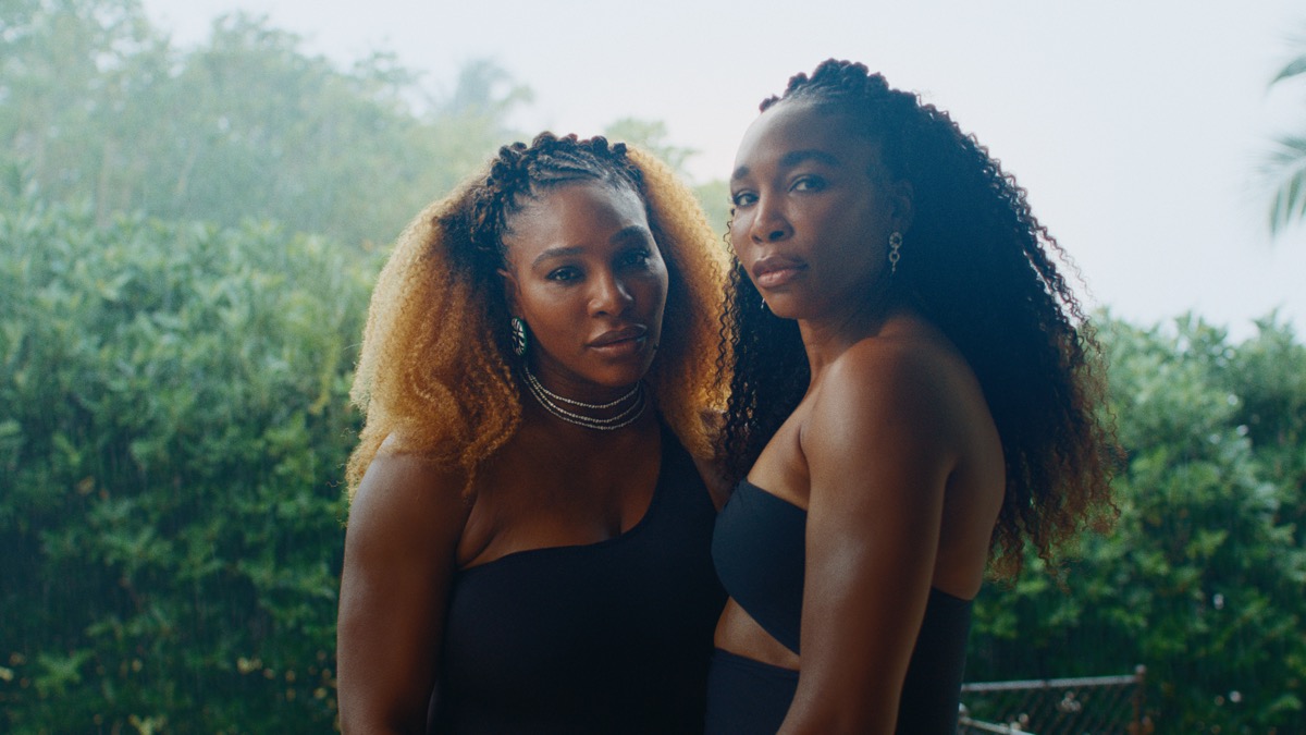
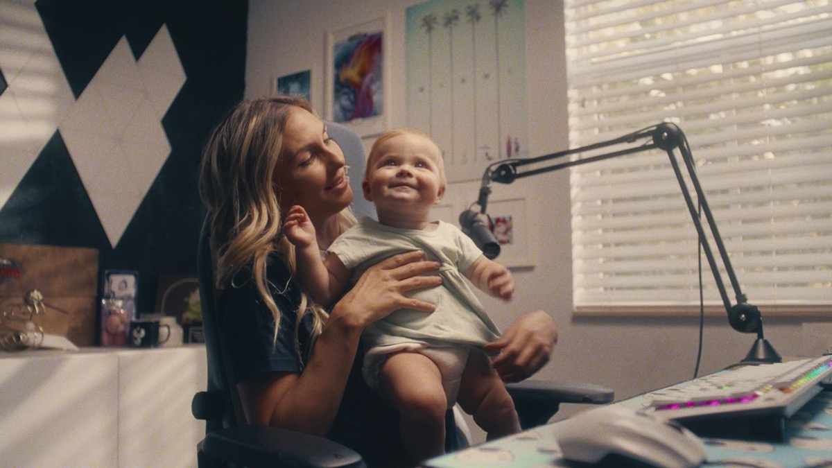
Faces cannot feel muddy, plastic, or accidental. Clean skin makes the room feel controlled before a word is spoken.
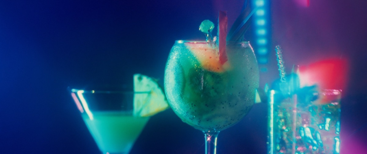
Liquor, apparel, cars, food, interiors, and tech all need color that feels premium without breaking what the product actually is.
Final color should protect highlight detail, shadow shape, and color density across web, social, broadcast, and HDR-ready versions.
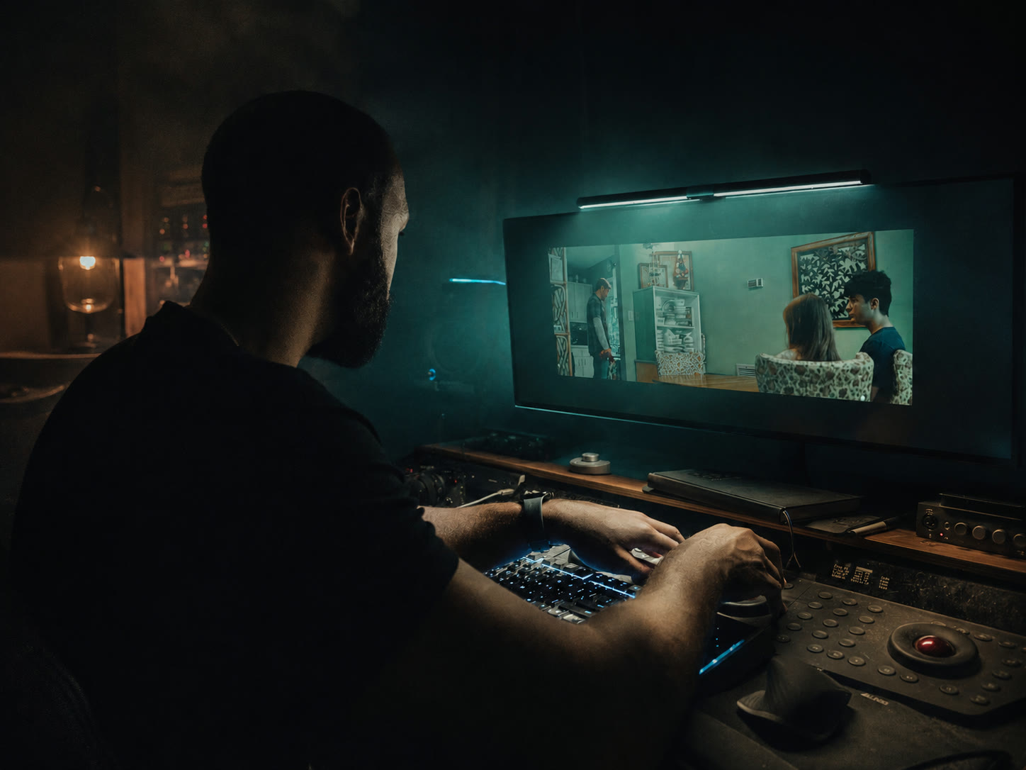
The job is to take the captured image and finish it with intent. Shot matching, contrast, skin, product color, masks, cleanup, export specs, and version control all affect how the brand feels when the link gets sent.
The flat source frame with room for exposure, contrast, and color decisions.
The technical baseline for review, client notes, SDR exports, and approvals.
Contrast, color density, skin, and brand tone shaped for the final placement.
The strongest grades do not just change the image. They reveal the source, the transform, the final frame, and why each choice matters.
Build the quote →Reference frames, one scene test, camera transform, contrast language, skin direction, and brand color decisions before the full grade.
Shot matching, primary grade, secondary corrections, contrast, saturation, skin isolation, and final polish for locked edits.
Targeted cleanup that keeps texture alive. Good retouching should make the frame feel clean without making the person feel fake.
Hero film, cutdowns, verticals, and paid social versions matched so the campaign feels like one visual system.
HDR-ready finishing, SDR versions, web exports, social crops, review files, and delivery specs handled before final upload.
Mixed cameras, rough exposure, hard skin tones, bad white balance, and rushed edits cleaned up as much as the footage allows.
Beauty work is part of finishing. The goal is not to hide the person. The goal is to remove distractions so the audience can stay with the story, the face, and the offer.
Think about her wedding day. Six hours in and the makeup creases. A breakout shows up the night before. The venue light is harsh and the camera catches all of it. On the biggest day of her life, her skin should never be the first thing she notices on screen. That is why this work matters. Clean skin that still looks like her. Not a filter.
Locked cut, XML or project file, reference export, camera notes, and any brand or client references.
One scene or short sample gets shaped first so the visual direction is approved before the full pass.
Shot matching, skin work, product color, cleanup, and platform-specific versions are handled in the final pass.
Review files, notes pass, final exports, and delivery specs are packaged for the places the work will live.
Color pricing changes with runtime, number of shots, file path, footage condition, retouching needs, review rounds, and delivery specs. Start here and the scope gets clear fast.
Book the color review →Lower saturation, heavier contrast, stronger texture, and controlled highlights. Use it when the frame needs toughness without looking messy.
Warm faces separate against cooler shadows and environments. It gives the subject depth without needing the background to compete.
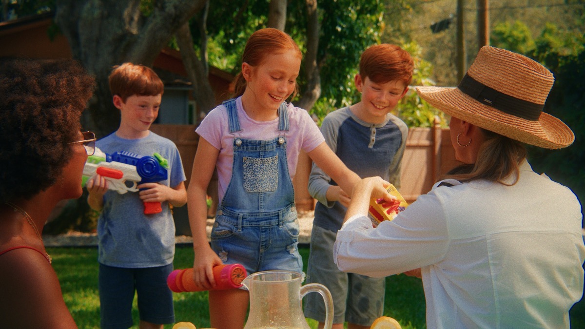
Lifted shadows, softer contrast, clean whites, and protected product color. This is the safer lane when the brand needs polish.
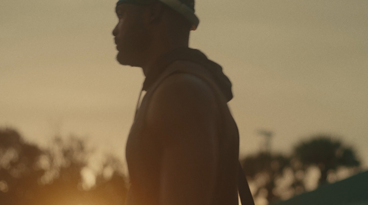
Stronger shadows, shaped highlights, and a more intentional black point. It works when the frame needs weight and focus.
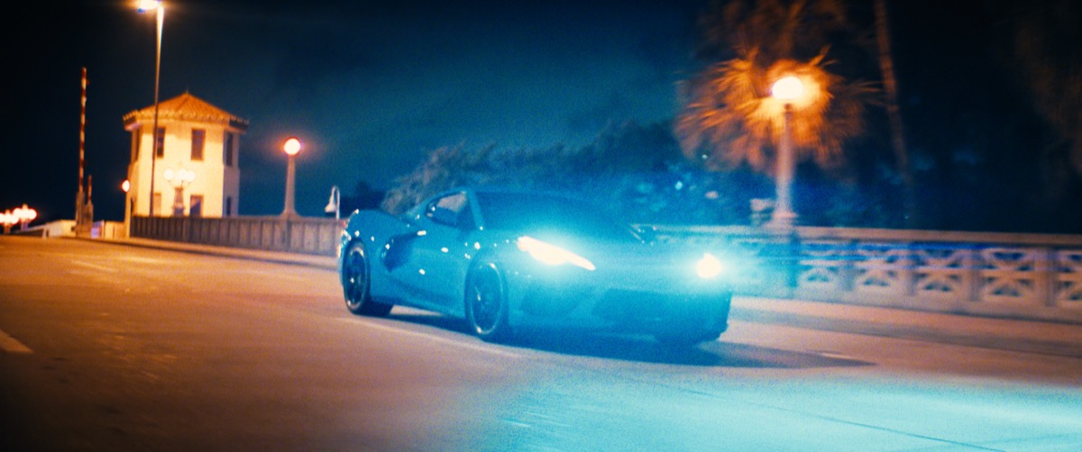
Rich color, stronger brand cues, and higher energy. Use it when the work needs to feel immediate, social, and campaign-ready.
Send us the edit. We handle shot matching, the look, skin, product color, cleanup, and HDR-ready delivery. Color grading services in Tampa and Florida for brands, agencies, and filmmakers.
The Tampa Colorist color series breaks down the same workflow we use on client work. Look development, skin, product color, and Dolby Vision finishing, taught step by step.